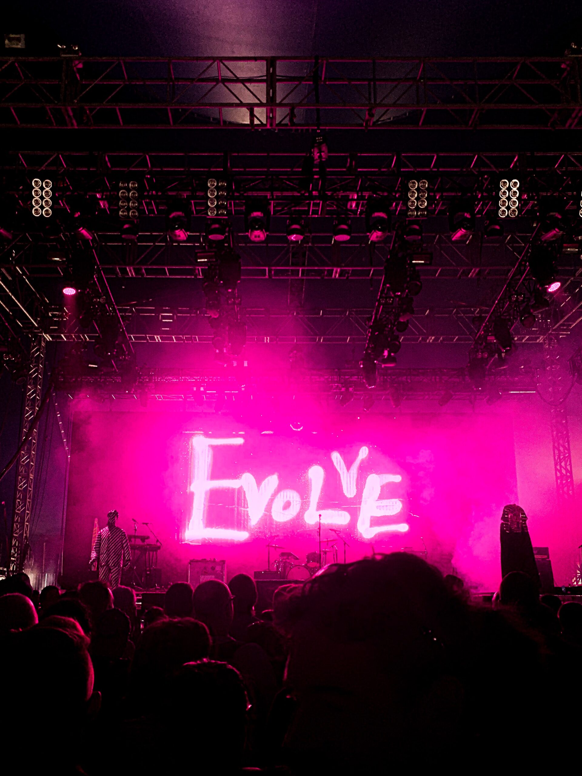
I love the feeling of a fresh start. It gives me a little burst of energy. With a new year comes a handful of fun traditions in the world of interior design. Manufacturers and well-known designers predict popular syles, painting techniques and patterns that will emerge as this years “go-to” looks. Many companies participate in a custom of naming a color that will be the top of everyon’s list. A well known color company, Pantone, is one to follow. Each year they select a color for the upcoming year. Sometimes the choice is revered by the audience, other times it’s disliked but it’s always interesting to see how this color will thread itself into projects.
2023’s Pantone Color of the Year is Viva Magenta; “An unconventional shade for an unconventional time” (Lang, 2022). I like the idea of an unconventional color for anything design related. My tendency is to always go for the less common and the more unique to really give each space it’s own personality. Pantone’s reasoning behind this choice is “a bold shade of red that speaks to the strength and vitality needed for forging a more positive future” (Lang, 2022). I can’t say that I disagree with the sentiment we need a positive outlook for the foreseeable future but does that feeling egnite inside of you when looking at this color?
Photo Courtsey of Pantone.com
We are also alive during a interesting time where colors, toys, clothing and people are becoming non-bianry. I find myself teaching my daughter that certain things are not just for girls but for everyone. There was a boy at her preschool who wore a pink hoodie one day, you could tell he was really excited and proud to wear it. Another boy commented “pink is for girls”. I kindly stated that pink was for everyone and a third little boy replied “yes, I also like pink”. This was a really amazing eye opening moment for me. Not just as a mom but as a women thinking about all the lessons I was taught growing up and why I look at a color like Viva Magenta and feel like it is a feminine color. I am not wrong for feeling that way, however I wish to teach my child differently. I want more of an equal thought cycle for her, understanding that people and colors can identify differently for everyone.
The more I research Viva Magenta in interiors the more I fall in love with it’s vivid hue. I have included a handful of photos to illustrate how this color can be used sucessfully within a space:
Photo Courtsey of Pinterest, Blogsampleboard.com.
Photo Courtsey of Pinterest, Hunker.com.
Photo Courtsey of Pinterest, Oldhouseonline.com
Photo Courtsey of Pinterest, Refineanddefine.camberia.usa.com
Find something that ignites a spark of inspiration within you, for whatever it is in life you might need to feel inspired for. I always start my projects off with some sort of design research in order to pinpoint a source of inspiration. It could be a color, art work or tile that sets the tone for the project. I keep a Pinterest board of things I love and I go back to it often when I am in a creative funk.
This is the part of my article where I like to remind everyone that hiring an Interior Designer is important but it’s imperative that you are able to communicate clearly and efficiently your expectations. Yes, Interior Designers are part mind readers but please do your homework. Understand the cost of materials as well as what charges your chosen contractor will bill for installation. We are here to guide you toward your vision but we can not make magic happen without budget guidelines and some visual reference.
I hope you all find a Viva Magenta moment in 2023 and can splash a little strength and vitality into your new year!
Dream. Design. Redefine.
-Niki Milliken


