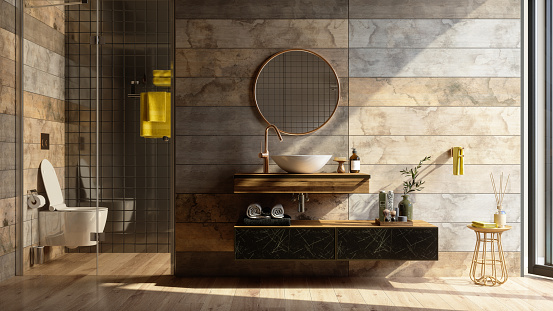
To tile, or not to tile, that should never be a question! Tiling is a fantastic way to bring color, pattern, and texture into a space.
There is always a place for tile.
Similar to furniture, it can range in price, but this depends on a few factors:
- Shape & size
- Type of material
- The complexity of the pattern
- Color
- Texture
- How the material is manufactured (by hand or machine made)
- Popularity
Examples:
The below black and white selection has a lovely intricate pattern. It comes in an 8” x 8” piece with one pattern on each tile making the installation process simple.
Photo courtesy of Flooranddecor.com: Bohemian Black Porcelain Tile.
Metallic Elements
Adding a metal element to a backsplash or wet bar can give the area more dimension. Many companies now even add options with metallic grout lines.
In the photo below, you can see several different shapes, and patterns of tile with gold grout lines. This particular installation would be time-consuming and more expensive, but the end result speaks for itself.
The “Uncommon” Placement
Tile being used in unexpected places is more common now than ever before.
For example, one might expect to see it as a black splash in a kitchen or bathroom shower. Now it is being used in accent areas with floating shelves extending up the walls in kitchens, shower ceilings, and even laundry rooms.
Variety is Trending
Variety can be seen by adding more than one tile to a space. Many designers nowadays specialize in this technique.
Real designers are mix masters, who don’t want an “out-of-the-box” solution, and strive for a highly curated selection of materials. This is what often separates designers from one another – to each their own style. Variety can help to create this mix, if done correctly.
Photo courtesy of DecorPad
Photo courtesy of TileShop.com
Grouting Techniques
Grout can be used as a tool to enhance, or even hide a pattern. This can be seen with grout color and thickness.
Depending on the countertop material and the cabinet color, designers may suggest hiding the tile pattern so the room doesn’t look too busy. In some cases, the finishes are so neutral that the minor details need to pack a punch.
Here are some good examples:
Black tile with charcoal grout to give more of a subtle pattern.
Photo Courtesy of Bedrosians Tile & Stone
Black tile with white grout to highlight the tile shape.
Photo courtesy of Floor & Decor.
Grout Pricing:
It is important to note that using smaller grout will increase installation time and overall cost.
Varying tile size and thicker grout lines can be a great combination. Imperfect edges of handmade tile like cement, unglazed, or zellige are all good examples.
Photo Courtsey: Zia.com, Zellige tile.
Below is a recent project our company finished for a client who was looking for an eclectic, bungalow type design for her kitchen. We were so pleased with how this simple shaped tile was able to bring so much color to this sophisticated, neutral pallet.
Photo courtesy of Milliken Design Studio
Regardless of the tile size, it is important to consider options when it comes to pattern, which can be created using the tiles themselves.
Below is a handy chart which illustrates some of the more popular patterns being seen with interiors today.
There once was a time when the sheen on tile was only glossy.
Now, we have glossy, or matte.
Both options are used, but it truly comes down to the type of aesthetic a client is wanting to achieve.
Black subway typically goes well with a matte finish, while a white subway tile can be complimented with a glossy sheen.
Photo courtesy of Reddit.com
Tile in a Nutshell
Each project can hold a space for fun elements, and tile can be the variable which adds the right amount of visual appeal a client is looking to implement.
With any material, it is important to first get samples and mock them up in the area being resigned.
Go slowly, choose wisely, and take your time, because you only want to do this once.
Dream, Design, Redefine,
Niki


