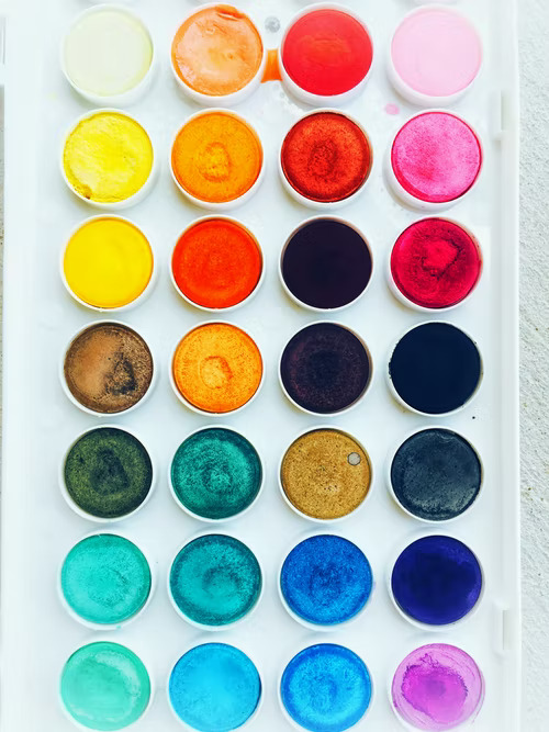
My favorite class in college was color theory, and I am still so fascinated by the fact that color can evoke emotions and influence people in the most subtle ways. Many of us have a favorite color or two. As a designer, I don’t typically use my favorite colors in projects unless it makes sense for the space. Mint green brings me joy. You will find it scattered throughout my home, on my website, and slathered on my front door. As I stated in my first article, if a specific color brings you joy then you should have it in your home or office.
My mint green front door and cute husband.
Photo Courtesy of Aimee O’Brien Photography
Exterior Design by Milliken Design Studio, LLC.
Another dynamic fact about colors is that they can work together to enhance one another. A common request when designing a space is to add a pop of color. Oftentimes, that results in a color or two that will not take over the space but will instead add some depth. In my experience, blue is the most requested color for an interior accent. Blue’s complementary color is orange but can also be paired with its split complementary color yellow. The same goes with mint green; it directly compliments light pink but another common accent is sherbert orange. When planning your space, think about how you can incorporate accent colors that complement one another. I worked on a kitchen remodel where we decided to use a cobalt blue for the cabinets and the backsplash tiles had notes of oranges, reds, and yellows to enhance the richness of the cabinets.
Adobe Court Kitchen Remodel: Showing complementary colors blues, orange, and yellow.
Photo Courtesy of Photos by Kimberly Ann
Interior Design: Milliken Design Studio, LLC
It’s imperative to think about colors in your everyday life and how they might make you feel when you surround yourself with them. I put together a list of popular colors and the emotions they can ignite:
-Yellows: Creativity, happiness, warmth, and cheer.
-Greens: Nature, healing, freshness, growth, and quality.
-Whites: Pureness, clean, simplistic, honest, and innocent.
-Blues: Trust, reliability, loyalty, peace, and competence.
-Oranges: Playfulness, warmth, vibrance, bravery, sociability, and confidence.
-Blacks/Grays: Sophisticated, elegant, formal, dramatic, and security.
Data Courtesy of: https://londonimageinstitute.com
The art of color theory has been around for ages, and in fact, certain colors can affect our decision-making process. This concept is so prolific that enormous corporations pay tens of thousands of dollars to come up with marketing campaigns that integrate certain colors to influence your decisions. A classic example of this is Mcdonald’s. It’s no coincidence that their colors are yellow and red. In fact, the reasoning behind the signature color combination is that red and yellow remind us of Ketchup and Mustard, therefore your thoughts (hopefully) gravitate toward enjoying a burger and fries. Many brands have adopted this method of marketing and generating business based on emotions with color.
Color touches our lives in almost every way. Think about the movies or TV shows you watch, the clothes you buy, the paint on your living room walls, or the fabric on your favorite chair. Color helps tell your story whether it’s your outfit, in your home, integrated into your brand logo, or online presence.
In the current world of interior design, many of the popular styles blasted on TV, in print, or on social media highlight layered neutrals (creams, whites, grays, beiges, and blacks). I am a big fan of this look, however, there is also a place for a fun, funky mashup of color and pattern, and if that is what you are drawn to, embrace it!
Tree Swallow Power Bath Update: Showing complementary colors pink and light green.
Photo Courtesy of Milliken Design Studio, LLC
Interior Design: MIlliken Design Studio, LLC
Dream, Design, Redefine,
Niki


